Spatio-Temporal and Causal Analysis of Road Traffic Accidents in NYC
This task analysed relation between traffic incidents in the New York City (NYC) and road network. The objective was to detect patterns that would show us potentially dangerous situations, that in the road network exist.
Two datasets were used for this. Motor Vehicle Collisions - Crashes dataset from NYC authority provided by police department (NYPD) and cartographical data from OpenStreetMaps for the NYC to plot the accidents.
Motor Vehicle Collisions - Crashes dataset here
The accidents dataset is very detailed and thus large in size, approximately 463 MB. As a result, we need to filter lot of data first to process only those we truly need. At same time, we need to keep those which can enable discover something new.
For this reason, the dataset was limited to the incidents starting from 1st January 2022 until present. In this context, the last record is 3rd August 2025, thus the data on year 2025 are until this date.
Time analysis
Firstly, I made a script that creates a simple CSV table (heatmap.csv) that enable us to plot the collisions into timeline, so we could try to see some pattern there. For this reason, the CSV just shows sum of traffic incidents for each day, so we can compare the days year to year and in general to get basic insight into the data.
I also run a basic statistical description to see how the records are distributed:
Statistical description of the dataset:
YEAR         2022        2023        2024        2025
count  365.000000  365.000000  366.000000  215.000000
mean   255.008219  243.871233  228.628415  220.613953
std     34.598441   30.059965   29.983167   28.955570
min    154.000000  144.000000  141.000000  144.000000
25%    234.000000  224.000000  208.000000  202.000000
50%    257.000000  245.000000  228.000000  224.000000
75%    278.000000  264.000000  247.000000  240.500000
max    341.000000  349.000000  323.000000  296.000000
With slight exception in the current year (very probably caused by incomplete data), the mean very closely follows median (Q2, or 50%). Thus, we can say that the records are equally distributed and are close to the standard distribution. Apropos, we can see that number of incidents decreases year by year.
When plotted and represented by heatmap, we can see some "clusters" of above average values. The pallette in heatmap is quartile based – so, it takes into account the distribution and highlights the extremes. For the purposes of determining when most accidents occur, the dark shade of blue is relevant, and the least accidents a represented in pale yellow. Given the distribution of the data set, we can say that the values expressed by the dark blue shade corresponding to the third quartile also show on which day of the year the number of accidents was above average. This also applies to the first quartile and balow average values.
While it is impossible to say unequivocally in which specific period more collisions occur, as this varies from year to year, the visualization shows that there are fewer accidents in the first four months. Then, more accidents occur at the turn of spring and summer. Many accidents occurred during the summer of 2022, but the pattern was not observed in other years.
In autumn and with winter approaching, the number of accidents increases again. However, this is reflected in greater extremes between days rather than a longer continuous period. This may be due to travel in connection with Thanksgiving, when many families travel at once and there are many vehicles on the roads, which increases the likelihood of accidents. However, further analysis would be needed to confirm this assumption.
Nevertheless, it is clear that the number of incidents is steadily declining, which is particularly evident in the lower number of extreme cases. New York City adopted the Vision Zero policy in 2014, and it seems to be bringing about change. This decline is not a statistical error.
Geographical distribution
Now, the more interesting part - where the most incidents take place? Concerning the size, I made the following tasks with the dataset:
- First, I grouped them using HDBS algorithm. This algorithm tries to make a spatially aware clusters with only requirement to set up minimal number of elements in it. This is the most suitable clustering method for this task, because we deal with data with varying density.
- Although there were many records that cannot be clustered, the majority of data found its cluster. Furthemore, in vast majority of cases the probability that an element belongs to a cluster is very high, therefore, they are highly informative.
- Then, I made some statistical operations (mean, std. dev and z-score) and filtered the highest ten. The points coordinates are mean of all records for that cluster, therefore they can slightly variate. Finally, I plotted them to the map.
Where the most incidents take place?
The following map shows the places, where the most vehicle collisions happen. The more saturated the point is, the count of collisions is higher.
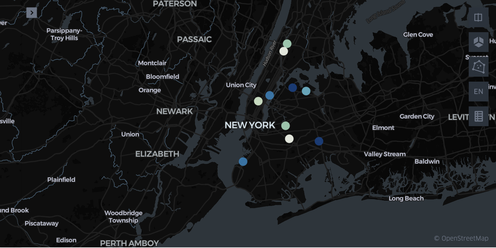
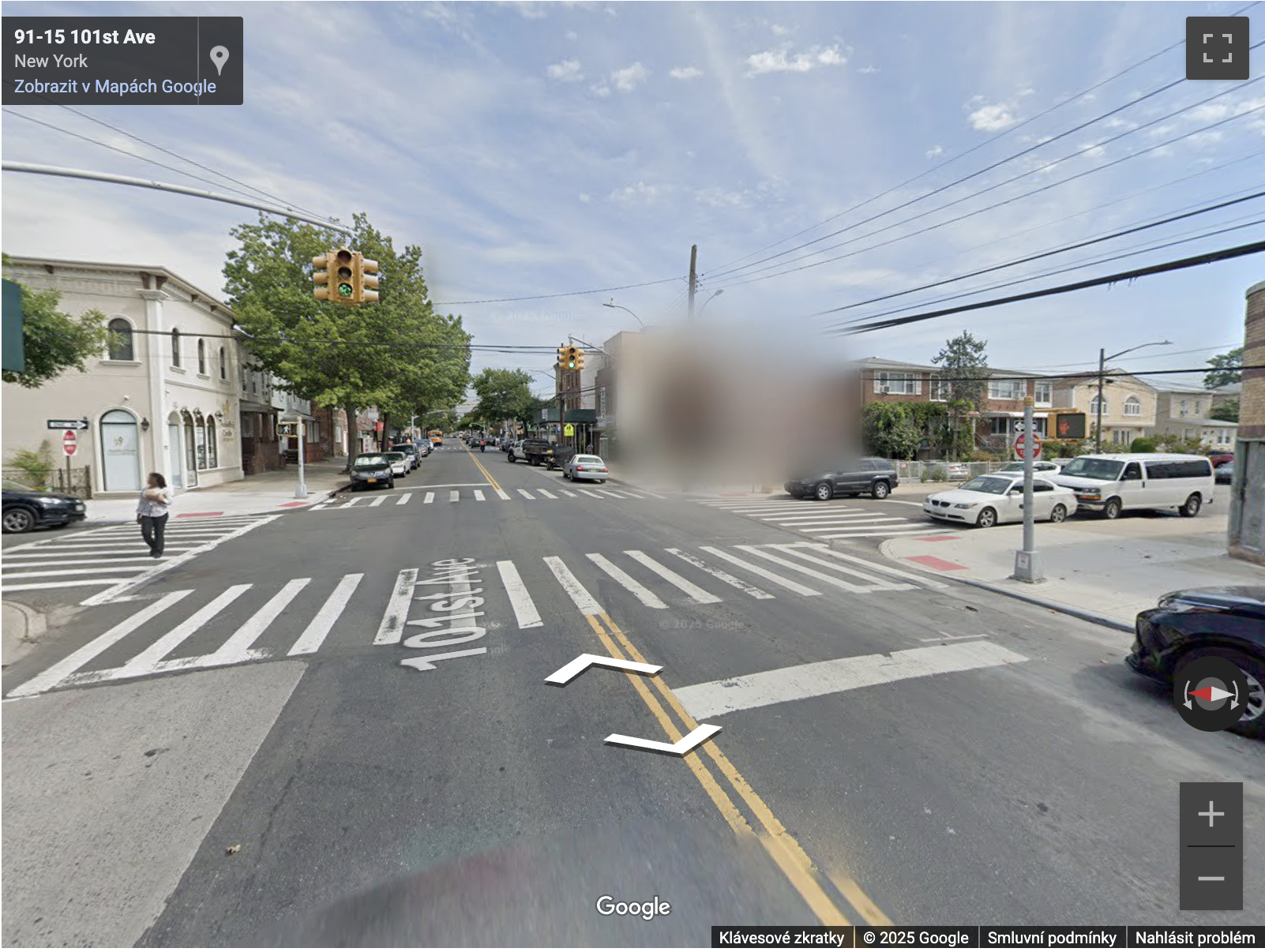
Highest count of collisions happens at intersection 101th Ave and 92nd St. 282 of them happened there from the January 2022, the dataset begins. Although it's the most common place where drivers crash, nobody has died here.
The second most frequent crash site is the intersection of Ditmars Boulevard and 38th Street with 253 occurences. This time, there were also deaths in this location.
Both locations are more residential with apartment buildings. From observations from Google Street View, people cross at this places, and large cars park here, so possible colission with pedestrians are probable.
But from the cluster analysis itself, this cannot be confirmed. For this, dig into the data of this specific cluster would be necessary.
All ten plotted points have something in common – they take place at intersections. At same time, these are not the largest one in the city. My assumption is, that although incidents at this places are more common, fatatilies and damage is not so high.
The most dangerous places
Different story is told when we plot crashes with the highest Z-score of deaths. In other words, these are the places where people most often die, if collision occurs.
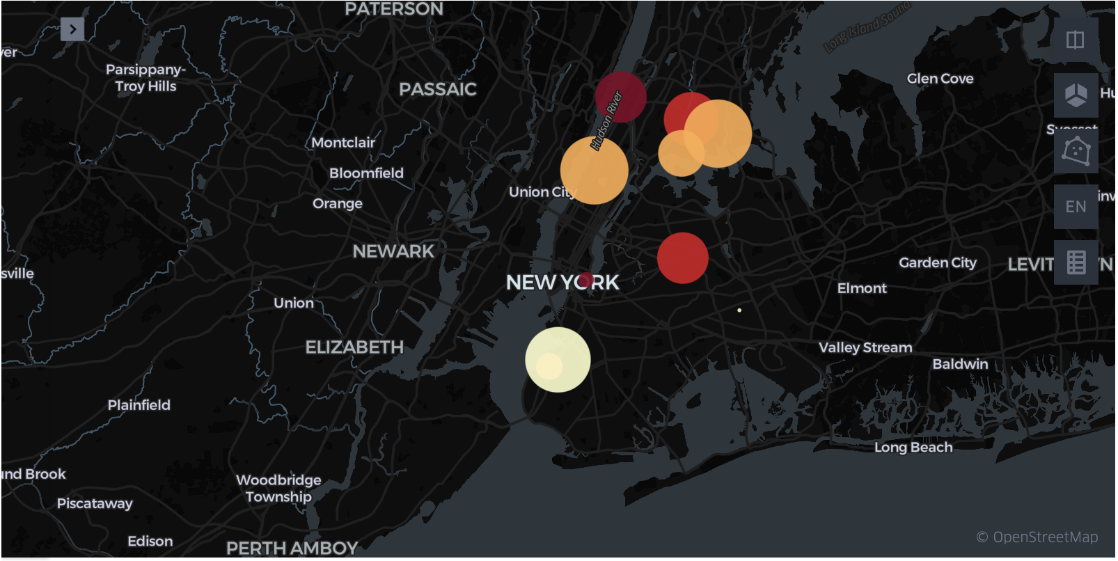
The most dangerous place in NYC is George Washington Bridge and Henry Hudson Parkway interchange. Z-score is 1.105 with 64 incidents.
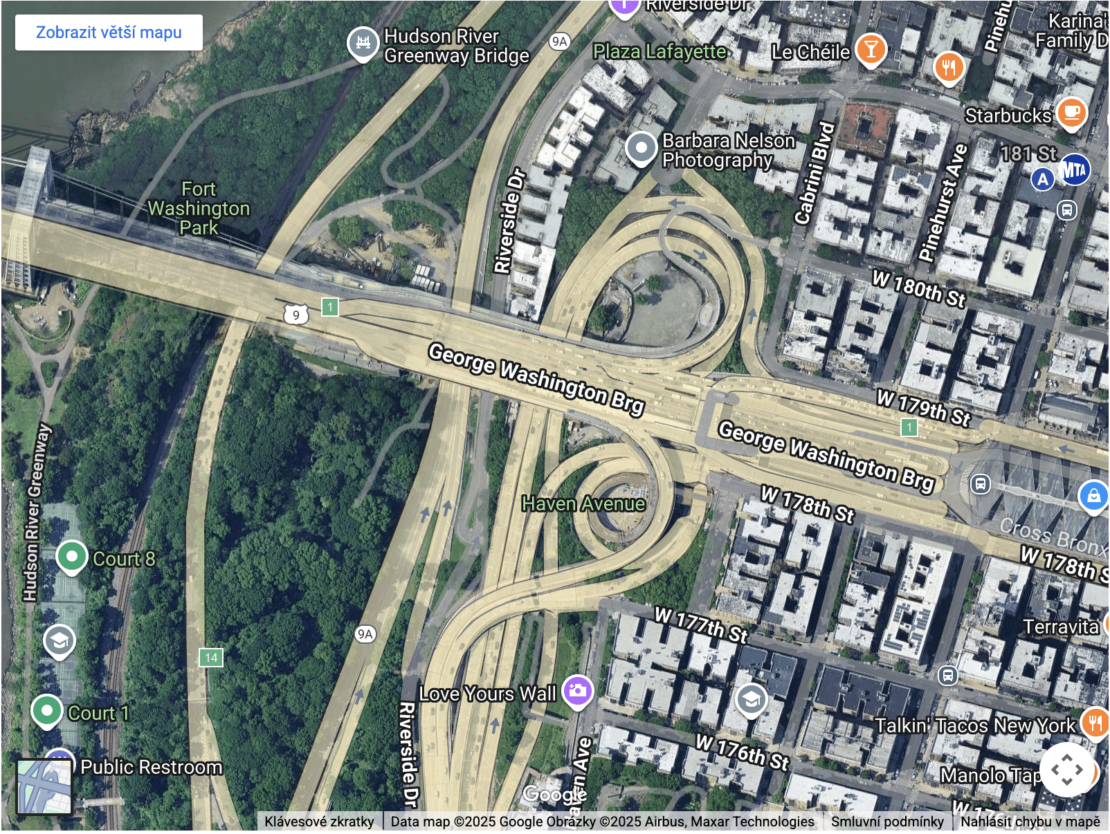
The second place is at Cherry St very close to FDR Drive. From satellite images, there is connection lane leading to the highway.
In general, points in this map have one in common – they are situated to the places, where traffic is heavy and (or) fast. This includes large intersections, highway on-ramps, or multi-lane roads.
Key findings
The conducted analysis revealed the following findings:
- The count of collisions decreases year by year. This decline is reflected in two ways: in a lower average number of accidents and in fewer positive extremes (i.e., the number of days with above-average accidents).
- Conversely, it is not possible to clearly identify a period when more accidents occur, but the autumn period, especially the second half, is more extreme in this regard. Fewer accidents occur during Christmas, and there are also relatively fewer accidents from the beginning of the year.
- Most accidents in the city takes place at intersections in the residential areas with apartment buildings. In contrast, the most fatal accidents happen on areas with dense traffic and on multi-lane high speed roads.
These findings also outline the direction in which the analysis could further continue. For example, if a person dies in an accident in a residential area, whether it is more often a driver or a pedestrian, and also what types of accidents are most fatal.
This project was created as a task solution for Digital Talent Lab at MUNI